Case study · Personal brand · Website · 2026
This portfolio — untangling my own story.
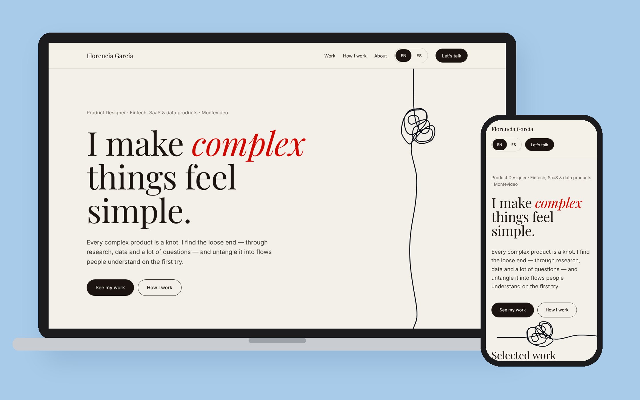
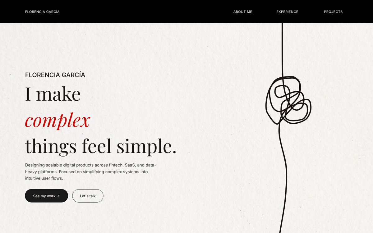
My 2025 portfolio already had the right idea: a hand-drawn knot and the line "I make complex things feel simple." The site just didn't live up to it. I redesigned it from Figma to production, with Claude as my build partner and every decision in my hands.
- Role
- Designer and builder
- Tools
- Figma, Claude, Claude Code, Netlify
- Scope
- Concept, home, three case studies, CV, English and Spanish
- Status
- Live at florencia-garcia.com
1 idea
kept from the old site: the knot
2 languages
English and Spanish, one click away
3 case studies
each one in its product's colors
0 invented numbers
if it's on the site, it's true
01 · The problem
A good idea, buried under everything else.
The old home opened with the right promise, but to reach a single project you had to scroll past about me, tools, experience and skills. It said what I do without showing it.
- Projects came last, after five other sections
- The knot was decoration — it didn't do anything
- English only, while I work in Spanish and English
- Case studies didn't feel like the products they described
- The CV looked like it belonged to someone else
02 · Key insight
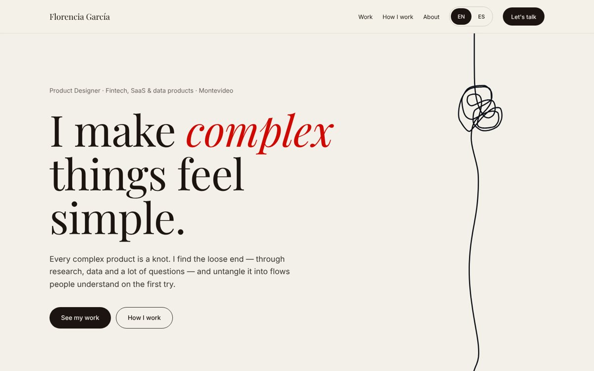
The concept was already right. The job wasn't to find a new idea — it was to make the site behave like the one I had: start tangled, end clear.
03 · The knot
A knot that untangles as you scroll.
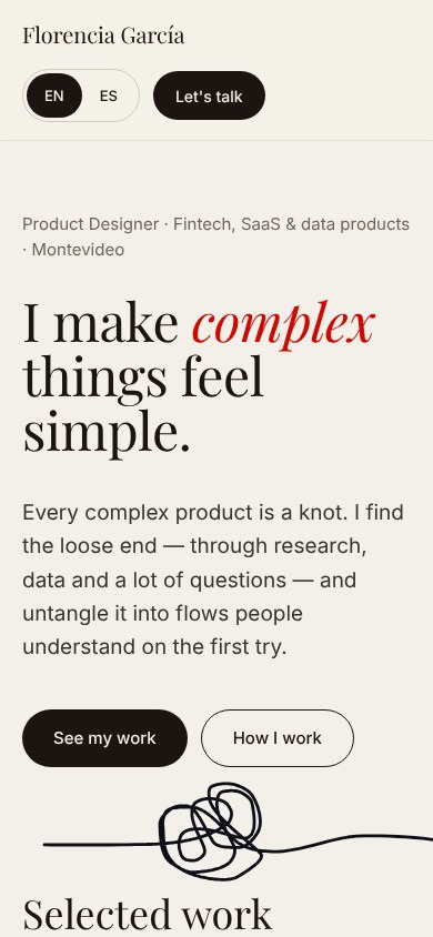
I kept the knot I drew myself in Figma. In the hero it starts tangled at the top and straightens out as you scroll, ending right above Selected work. The first thing you do on the site is untangle something. On phones it runs sideways so it never covers the text.
04 · Process
Claude built fast. I decided what stayed.
I explored layouts with Claude on a design canvas, then used Claude Code to turn them into a plain HTML site and put it online. I had never deployed a site before; Claude Code ran every deploy while I reviewed the changes. AI made trying things cheap, so most of my job was choosing.
- 01Define the storyWhat I want a recruiter to understand in five seconds: I untangle complex products.
- 02Explore on a canvasHome, case studies and CV as artboards, reviewed and changed section by section.
- 03Build it for realA static, bilingual site that works on any screen, with no framework to maintain.
- 04Ship and keep editingEach case study went live on its own, one project at a time.
What I said no to
Fast iterations mean lots of options. These are some of the ones I turned down, and why.
- AI as the headline of the portfolioAI as one tool. It shows up where it was really part of the work, like Tefi and this site.
- A thread running down the whole pageOnly in the hero. It untangles once, then gets out of the way of the work.
- A knot-shaped cursorThe normal arrow. Clever, but it made the site harder to use.
- Filling gaps with impressive-sounding numbersOnly facts I can back up. Where data is confidential, like HUB, the page says so.
05 · Case studies
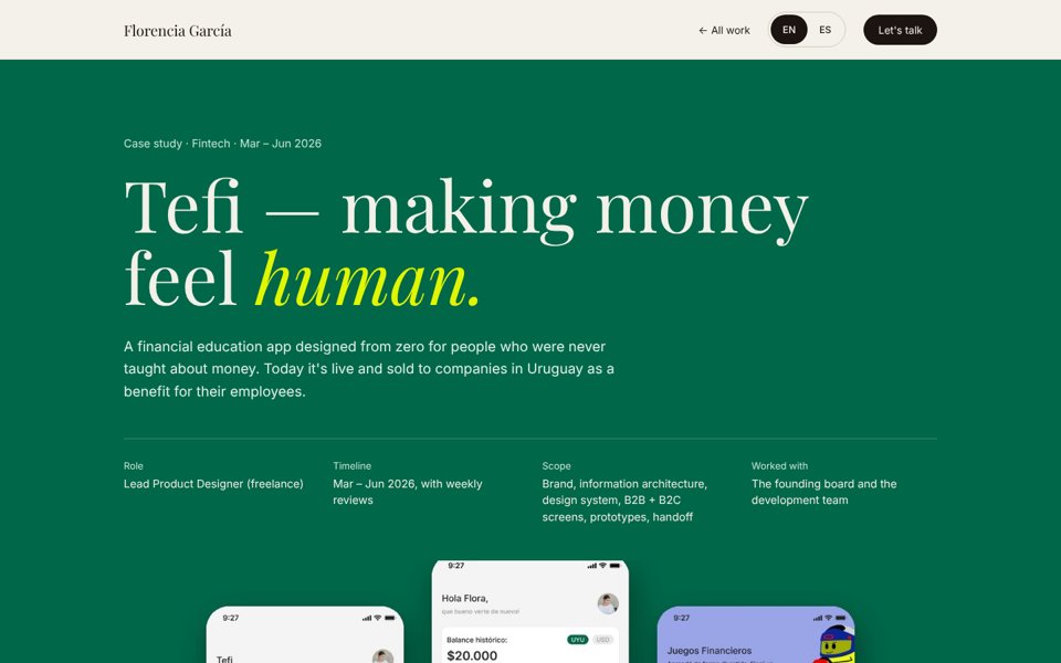
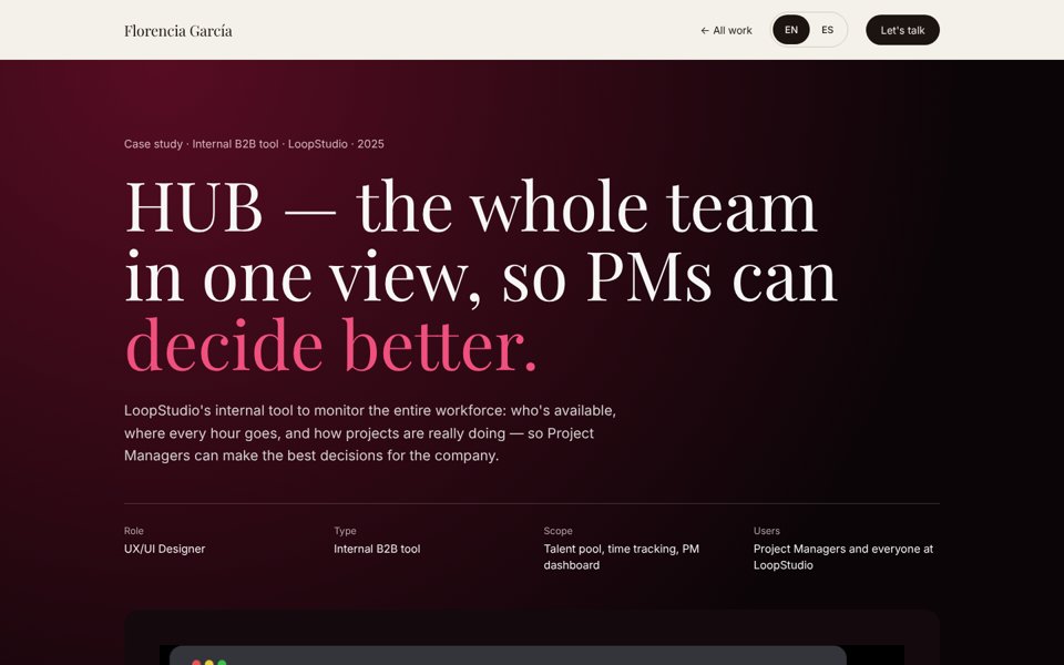
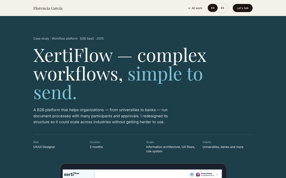
Every case study feels like walking into the product.
The nav and footer stay mine. Everything in between borrows the product's own colors, so you feel the switch the moment you open a project.
06 · Details
The small things that make it work.
- English and SpanishA toggle in the nav switches the whole site and remembers your choice across pages.
- Made for phones tooEvery page was checked at phone width — no sideways scrolling, nothing cut off.
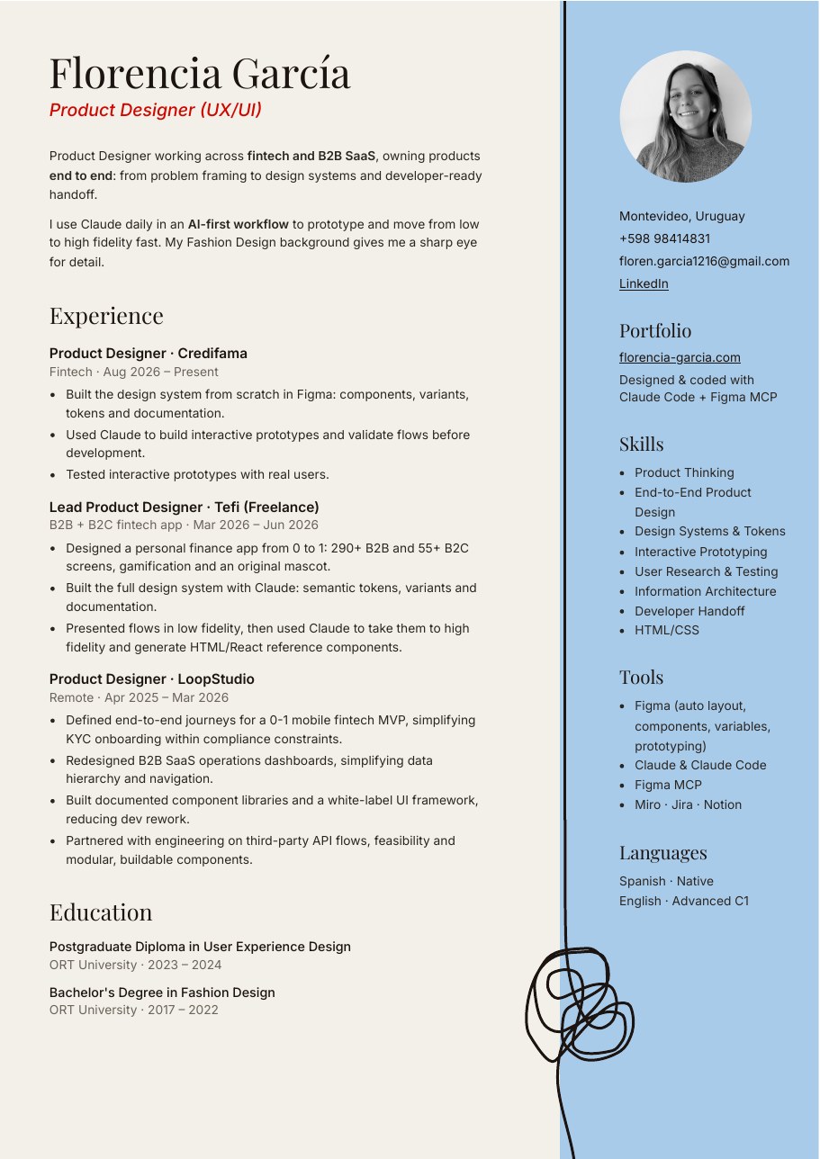
- A CV that matchesSame fonts, same colors, same knot — so the PDF feels like part of the site.
- Simple to keep alivePlain HTML, CSS and JavaScript on Netlify. Nothing to update, nothing to break.
07 · Outcome
Live, bilingual, and true to how I work.
The new portfolio is live at florencia-garcia.com, with three case studies, an English and Spanish version and a CV that matches. It shows my work first, and everything on it is something I can stand behind.
What I learned
- AI changes the cost of trying, not the need for tasteGetting ten versions is easy now. Knowing which one is right is still the design work.
- Your own idea is usually the strongest oneThe knot was mine from the start. The redesign was about giving it a job.